
Throughout our lives we seek to balance those dreams and goals that we so precariously carry. But we cannot plan for events beyond our control, whether in the form of a predator that left behind the feathers collected and incorporated into this piece, or in the vagueries of corporate organizational change.
Process
For this section, the brief is to do a self-portrait at large size. I toyed with many ideas as I worked through the course.
Planning and Ideation
At the start, I was looking at the image that starts the unit. This is an study that Degas did of Manet, for a later portrait. It reminded me of my Grandfather’s RCMP peacoat, and the many ties I have in my closet — from the years I had to wear suits to work.
Manet’s beard, and his thinning hair, echo my own. I was initially thinking of starting off from here.
From there I moved on to Egon Schiele. His wandering organic lines really draw me, and I’ve long been captivated by the intensity of his work. The spareness of how he renders the clothing is both remarkable and also very tactile. It feels ‘real’.


Then, as things do: shower thoughts. I was thinking about a particular coffee mug, for reasons unknown, and thought of it wearing my headphones. In my mind it became somewhat totemic of my work-from-home experience: drinking coffee, and spending endless hours in virtual meetings. Then, in my free time, watching twitch streams and YouTube with the same headphones on. I must spent 10 hours a day with these things on my head, and a coffee mug perpetually in my hand.
I’m not sure how, but this lead to Rene Magritte, and The Son of Man. Shower Thoughts are strange and unpredictable.


#3 I’m playing with the composition of what I think I want to do. Although I was thinking of Magritte, I clearly didn’t want to obscure the face. The assignment is very clear that a face must be recognizable — no cheating. Given I have these objects on my mind, I went with balancing them on my head.
I’m tempted to go with the straight-on pose, and come up with an expression to make it interesting. That or a 3/4 pose. Profile doesn’t speak to me here, and the large sketch is too similar to the pose in Assignment 3.

To the left are some pages from my sketchbook as I worked away at ideas.
In #1 (left) my initial thoughts around peacoat start to form. Then a tangent on wicker as a texture, as I remembered one my tutor’s comments from section 1 on a textured balled I drew.

I can see this being a neat effect, but I decided this didn’t really hit the right “spot” for what I wanted to do.
Page #2 I started exploring compositions, and rendering some ideas. I tried out some ball point pen, starting in on a face before abandoning. I really like the effect, and the ability to build up layers, but decided this would likely take more time than I have.
I really like the upper-central pose. But I’ll put that one aside.
The Fork/Knife in the pocket of the peacoat lead, I think, into considering other objects in the image. I don’t know where the fork and knife came from, but for whatever reason they look like they fit well.


Drawing Session 1

A self portrait of at least A3? How about A1? I don’t think I’ve really done much at this size, ever. Assignment 3 was close.
Since I’ve done very little in charcoal this year, I’ve decided this assignment will be done in charcoal. I had some thoughts to sparingly apply some colour via pastels, so I couldn’t use graphite — graphite resists pastels.
As I’ve been thinking about part 5, I’ve been wanting to incorporate fiber into work. This is an echo to my mother’s craft — she is a skilled weaver. When I was home over Christmas, she gifted me a pile of cast off threads from her loom. We had been talking about incorporating these as part of ‘memory’.
Before I make use of those threads, I want to get a handle on how to use them. Originally I was thinking of gluing them to the paper (which I may still do) but I stumbled on an online course for embroidering paper.
This gave me the idea to incorporate this method into the Part 4 Assignment. From here the book Jean Draper’s Stitch and Pattern* came up in my searches, and I’ve since acquired it and leafed through its ideas. I don’t know how much I’ll incorporate fiber into my work, but this book really opens my eyes towards abstract ideas.
In terms of subject, I was thinking of a messy coffee mug and my work headphones. Symbols of being in the office. This evolved into just the coffee mug, which I decided needed to be perched precariously on my head. Calling back to my ongoing thoughts about my office job.
I’m wearing my grandfather’s peacoat. When he passed, my mother was going to cut it up and turn it into a vest (or some other apparel). I saved it from that destruction. I’ve had it for almost thirty years now, though it mostly hangs in my closet — I’m not as thin as I used to be.
The jacket speaks to how tall my grandfather was. I’m 196cm, but this coat’s arms are too long for me.
I love it. Its one of my most treasured possessions — which is weird because my grandfather was one of the most unpleasant people.
You can see the process through my first drawing session to the right.
On Light
I got a lot of light bounce from below. It creates this interesting, almost menacing glow under my brow. I could have eliminated that, but liked how it added definition around the eyes.
Thoughts on composition:
I applied a rule of thirds grid to the paper (you can see it faintly in these images) and decided I wanted my head to be very central. My right eye, tip of nose and edge of beard pass through the left hand grid line. Or is that the grid line passing through the subject? Anyway.
My thinking here is that this makes for a very ‘static’ or ‘stable’ composition. However, if I can push all the surrounding lines into odd angles, it will create a precariousness in the image. A sense that things might be caught mid fall, perhaps.
I’m getting awfully caught up in references to my career here.


Notes for fixing:
- My right shoulder is too square to the viewer. I need to adjust the perspective here. This really needs to be pushed
- I want the left shoulder and arm to be at a more extreme angle. As you can see in my concept sketches, my original idea was quite extreme (though I couldn’t physically replicate the pose).
- The ear is very weird looking.
- I need to fix the texture of the scarf, particularly around the chin.
Annoyances so far
- Some of my planning lines are extremely hard to erase. Some will be covered by the embroidery (they are my guide lines for that), but others are squiggles that were part of my lay in.
- I had forgotten how fragile willow charcoal is. How am I going to do the embroidery without smudging everything? I had intended to pause a bit earlier in the process and add the fiber, but I kind of forgot and just kept going.
Session 2: Fiber and Flight
I had intended this drawing session to proceed immediately on the day following the prior above. However, I came down ill and a few days passed. I think this was a good thing as it let me spend some time rethinking how I wanted to complete the coffee mug.
I knew I wanted it to be imprecise, imbalanced and precarious. I knew I wanted something coming out of it. As I spent time with this, and the concept of mug-as-career, I considered the ways that things might escape our grasp.
Which led me to flight.
And feathers.
A collection of feathers I have had for the last couple years.
I collected them from my front yard, one early morning shortly after my husband and I moved into our home. This was my first front yard, so to speak, that was ‘mine’. I had grand plans (since realized) to turn all that useless grass into garden.
And here were all these feathers. A grackle had fallen afoul of some predator overnight. Its remains were scattered about. My neighbours must have thought me insane as I picked about the yard and street and carefully collected a couple dozen tail feathers. Other remains were present, but they didn’t seem right to collect.
I cleaned these feathers and put them away. I knew they’d be used for something, but it needed to be right, and appropriate. Here is the use of the first four.
Material, Ethics and Cruelty
I avoid using animal products in my art to the greatest extent that I can, and if I am going to I am doing with reasoned intention and without cruelty.
So, to these feathers. How do I think of these feathers in these terms? How do I think of the ethics of using found feathers? To help me resolve this I reached out to a friend who teaches ethics at Villanova University.
Very quickly she pointed out Steve Baker’s Artist|Animal†, which I have not yet had the time to go through but have added it to my list to read.
From there we discussed how the feathers came into my possession. As I — and no human — participated in the death of the bird, and in particular did not kill the animal for the purposes of the work that removes one of the larger ethical concerns.
Here, we branched into a discussion around whether my purpose is “honouring” the animal, or is the use of material purely for the sake of inclusion. I am reminded here of Assignment 3 where I chose to not include gold foil out of concern that it added nothing to the piece, but was simply for the sake of using it.
“Honour” here becomes a fraught word, and one I’m ill equipped to define personally. My friend asked: Is my art going to encourage others to bring harm to animals? Am I certain the animal is dead? and then, are animals and their parts ours to make art from? So, to summarize she asked “How are you using the material and what does it say about birds?”
Birds are highly symbolic across so many cultures. Freedom, dreams, and elemental spirits of the sky. They can represent visions and guides. It is this symbolism that I’m leaning on in two ways: First, the cup that represents my career has tipped over and from it escapes the goals and dreams I set for myself years ago. But with one feather tucked behind my ear, it either is a new dream to follow or a spirit guiding me on a path.
Could I achieve the same effect in my art without using the feathers? I could certainly render them in charcoal. Draw them with fidelity. But the physical feathers lift off from the surface of the work; breaking the plane and achieves a reality that I could not render otherwise. They invade the viewer’s space.
Close Ups

I love the dimensionality that the knots and feathers bring to this work. My fiber work is inexpert at best, but I’m honestly thrilled with the results. They bring an abstract moment of rest, and yet they don’t take away from the intensity of the charcoal. They feel balanced to my eye. The work wouldn’t ‘work’ the same way if this was done flat with charcoal or graphite.
I have no idea how I will store this piece, but I love this result.

I had noted some visual issues with the pose, but with the addition of the fiber and feathers suddenly the whole is brought together. I feel that angular sweep in a way that the charcoal on its own doesn’t carry.
Perhaps this is a reminder to myself: There is so much I can plan with my art. Some of it can only be known after it is done.
Post Assignment Follow up
In the post-assignment conversation with my tutor, they suggested revisiting and expanding on the work to see where it might lead. An exercise in moving beyond the assignment itself. You can find the entire reflection here. I’ve consolidated the follow-on work below, from that page, along with some further thoughts on final presentation.
Inversion Diversion
The best way to learn is to do, and so I am immediately diving in to the mirror image drawing.
In this:
- I will invert the composition, left-right.
- I will invert the process w.r.t. additive/subtractive processes
- I will not repeat the feathers — It doesn’t feel right to include them in this experiment. I may change my mind, as the work progresses, particularly if I’m satisfied enough to consider the resulting diptych complete instead of as an exploratory exercise.
- I am as yet undecided about including the embroidery in the inversion. How would I invert that process in a meaningful way?
- I will not try to create the replica of the original. This is a second piece responding to the first.


I often pause and take walks in the middle of working. I always create my best work by taking a break. I think, in some way, I needed to lament the loss of the swirling lines I had when first applied the charcoal.
I’m intentionally not using anything but my memory and the original drawing as my references. I’m inverting the image by eye — no photographs to help me out.
A few interesting thoughts arose on the walk. I’ve maintained the same light source — the left side of the image in both. I’m not going to correct that, but will lean in instead. This does make me wonder if I have a tendency to assume a left-side light source? I should look at my other work.
A reminder from some YouTube video or another — I forget exactly where. Something along the lines of if you find yourself trying to lighten your highlights, try darkening your darks first. With that in mind, I came back from my walk with renewed focus on the contrast. I picked up some huge chunks of super soft charcoal, from the art store, on my walk. I’ll layer in new black in some areas, and then again subtract from that with my erasers. Would fixative help me here? I haven’t really used it with charcoal as I find it destroys the interesting surface textures (the very fragile surface textures)
Here, I began thinking about the upper left corner. Can I make these things that are coming together? thoughts and imagination? new ideas and dreams. Refilling the cup. No longer replicating/inverting, but creating and responding. Do I need to be accurate? no. can I steal from the cup the sense of reality, and push it into visual metaphor? let’s try


Side by side is an interesting visual. They’re clearly the same subject, but you can see which one I’m more confident with. Are they both effective? I think so. They say different things though.
The left is ( how do I phrase this?) more “magical realism”? the subjects look physical. The right is dream-like; its cup is drifting cubist and the jacket doesn’t care about shape and volume nor folding into itself.
Honestly, the jacket on the right is almost threatening. I don’t know how to describe that better. The subject is getting impossibly large (or impossibly closer?)
The background on the right is filled with my swirling thoughts. The left has been struck blank by the shock of the lost dreams.
On the technical side, I can see where I am most comfortable. I felt a lack of control on the right, and this comes through in the eyes, nose and hair.
Reflection
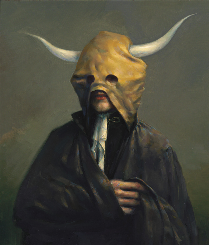
Briefly. It is remarkable to me how much I forget about what influences what I do. As I reviewing my tutor’s feedback, I was glancing through my bookshelves and I focused on The Pale Path1, a survey of Stephen Appleby-Barr’s work.
I picked up this book after seeing the artist’s work at a Toronto gallery, some number of years ago. I had quickly become enamoured with the blending of fantastical that occurs. Animal-human hybrid in various uniforms, and clearly part of some larger milieu but standing in ambiguous liminal spaces.
A great number of his works are portraits, and I can in some ways see the lines from his work into the creation of Symbols of Office, above.
Tryptych
In documenting these two photos, I decided to create a photograph wherein I show both the above, with myself wearing the jacket and holding the cup. I set my camera on a tripod, and repeated timer, allowing me to trial many different potential poses and expressions.
Ultimately I settled on a somewhat troubled, or pensive expression, holding the cup closely.

Presentation
How do I present something that I’m unsure will ever actually be complete? I can see myself continuing this series, producing recursive works based on the work immediately prior. I can even see myself physically making use of prior images to create a new one; destructive collage. What would that mean for presentation, if earlier works in the series were consumed in the creation of later works?
I don’t know.
I can imagine a long space, with the initiating pieces (above) presented at the far end. Then each subsequent piece alternating back and forth on the walls, back towards the entrance. As the visitors enter the room, they walk backwards in time through the combined work. I’d imagine the pieces closest to the door are the most abstract, and so the journey goes from ambiguity to solidity. I find that idea amusing.
Some Youtube videos referenced during this exercise
* Draper, J. (2018) Stitch and Pattern. London: Batsford.
† Baker, S. (2013) Artist|Animal. Minneapolis and London: University of Minnesota Press.
1 Kingwell, M. (2017) The Pale Path. (illustrated ed.) (s.l.): Black Dog Publishing Limited.