
Preamble
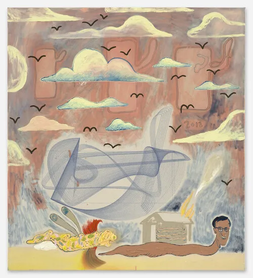
After I had created the image, my husband remarked that he felt bad that I hadn’t been able to realize my intent with this picture. I didn’t feel the disappointment, though. In the past I would have found it very discouraging, but I’ve honestly learned so much. And this is very encouraging.
In particular, I liked the surrealism of this. I can see ways I might push this further, and leave out the less successful collage/etc.
Intent
After having drawn a number of thumbnails and preliminary drawings (see below) I decided to describe the work before I had drawn it.
This work relates to my ongoing struggle to reconcile what I do professionally, and how I see myself and my identity. The trees and mountains represent the Canadian wilderness where I’ve always found peace and always wish I could spend more time in. Flowing from the subject’s mouth are streamers of printed computer code. This code is drawn from programs I’ve written that used to perform my personal market trading. They flow out into the lake, poisoning the waters.
The streamers are accented with gold foil, representing the financial markets, but the foil is not true gold. Over time the foil will develop a patina and will rust, while the printer paper will yellow, become fragile and perhaps crumble. The ink will fade.
The graphite and stone-based watercolour pigments will not fade. They will outlast the code and the gold.
Learning
As I drew the picture, and applied the collage, I learned a couple things:
- The printed code samples are on standard dot-matrix printer paper. This is bleached white, and I hadn’t considered that as I applied it to the main drawing. The paper I used is my favourite drawing paper and it has a creamy off-white tone. This makes the code strips look very blue.
- The code strips don’t mesh with the rest of the drawing. Part of it is definitely how flat text. Part of it is the small area/lack of cohesion. It feels like I just sort of slapped it on to hide some aspect of the image. If I had this printed in multiple font sizes, I could have created small slivers and integrated them into some other areas around the face.
- Ensure that I understand why I want to use one material over another and what work it is doing. Especially if I’m choosing to mix multiple media, make sure to consider the purpose and intended outcome. Simplifying is often a better path to conveying a message.
- I am still very interested in mixing different media. I need to keep doing these sorts of experiments so I can learn and gain confidence.
Materials and Techniques
I could put this under ‘learning’ but I think it merits its own block.
- Its very clear to me that the materials I am using hold special interest to me in as much as the subjects I am depicting. I think I began to see this through Unit 2 as I started learning how to make my own pastels, and make them from soil gathered from my garden. This then evolved in the connection between drawing gifts (oil lamps) on packing paper. It so happened that that packing paper was used to pack some of my art supplies. In this piece, investigating the use of printer out computer code which is a very direct artifact of my career direction.
- My struggle with materials is I don’t yet have a good foundation on when to use what. And perhaps Why. This, I feel, will come with more practice and experiments (successful or otherwise)
- Using materials that mean something is important. Choice of material is not neutral, I don’t think. Use of cotton, in North America, will echo the slave trade. Use of beaver fur will echo the conquest/settlement of Canada. Very real historical linkages. Later in this post I mention about Hugo McCloud using plastic grocery bags to echo class distinctions. Is this general theme something I want to explore further? Yes, I think. But I’m not sure how, when or where. As I attend more exhibits, and do more reading and learning about artists, this window is opening.
- On pure technique level, I tried something a little different with the graphite in this drawing. I used an indenting tool to preserve highlights in the tree trunk. The indents caused my pencils/graphite sticks to skip over the indented areas. I really liked the effect, but I need to practice so I have more control over what I end up with.
In Conversation
To help me stay accountable, and maintain focus, I maintain a small area of my social media presence where I talk about my art journey and post my learning log links. Only a few people have access, chosen by myself, and I expect nothing of them in terms of involvement.
However, by convincing myself that they pay attention and that I need to continually report on my status, it helps me keep moving forward. Mental gymnastics, to be certain, but it works.
When they do engage, however, it is really thrilling. One such individual, who I will refer to as H, is an artist in a different discipline. They messaged me in response to my crafting this post. In particular, the description of the art work, which I wrote before I created the piece. This was to help me really work through what I intended in the piece and why. At the moment of this conversation, H had only seen the description and not the final work.
With H’s permission, I’ve quoted some of our conversation, and will reflect on it here.
H: Question about the word “represent”… and the relation to other parts of the text. Sometimes you speak of elements as being and other times you speak of representing. Are there times in your work [where] your choices are to illustrate, demonstrate, represent, while at other times you are showing things as they truly are, or embodying experiences in your work?
Me: I believe I understand what you are asking. One of my biggest struggles is how to communicate about art — I’ve spent the last two decades in computing/finance, so this is new. But. I’m thinking in symbols here. Other than the printed computer code, none of the subject matter is from life. None of it is anything as it truly is. I’m trying to feel my way around a story here, around a narrative of change captured in a semi-static imagery. In most of what I’ve done to date, until this piece, I’ve worked very closely from reference as I build my technical skills. “Things as they are” I suppose. I’m not sure this is at all coherent
Me (continued): Also, I’m not sure I made it clear, but when I’m speaking about something being, in this text, (“the streamers of printed computer code” for example) I’m referring to physical actual objects I’ve used in the construction of the piece. This is the collage component. For the watercolours, where I’ve referenced “stone-based”, it is because I’ve chosen pigments that are made of ground stones and won’t change over time.
H: That is the fun part about reading about art, what is truly there and what is intention… so the streamers are printed code is a great example of me imagining without seeing, and wondering if this was a shift for you from showing me something (the times you talk about representing) to the speaking of things as they are… I really enjoy the shifts actually, it engages my imagination as a reader and makes me want to engage with the work. Clarity in art is such a slippery state, what is clear in what we do and what we say.
If I was to be clear in my reflections (and please take with a grain of salt, knowing that in contemporary performing arts, we think a lot about when we are really doing things, when we are pretending to do things, and when we are showing the audience something…)
- when are you representing reality as it is vs representing an imagined reality or a desired reality vs just documenting reality?
- when do the materials [represent] the message or when are they a pathway for the message?
I’m very interested in narrative and visual metaphor, so the question of ‘representing’ vs ‘being’ was very welcome even if I couldn’t quite respond to it in depth.
Through the course of this assignment, I began to question whether I was being too cute with my use of materials as metaphors. Coincidentally, I also ended up listening to a episode 518 of the Modern Art Notes podcast1, where the host interviews the artist Hugo McCloud.
Hugo talks at length about his choice of materials and how they tie into labour and class. In particular the use of plastic grocery bags to create paintings. This started me thinking about whether I was using the metal foil, and watercolours, because I wanted to use them, or were they truly important to the work.
In the end, I decided it was not. Perhaps this was a reaction to the code slices not looking how I wanted, and therefore self-doubt, but at best I think the result would be neutral to the outcome of the image if I had gone forward.
Influences
Jono Dry
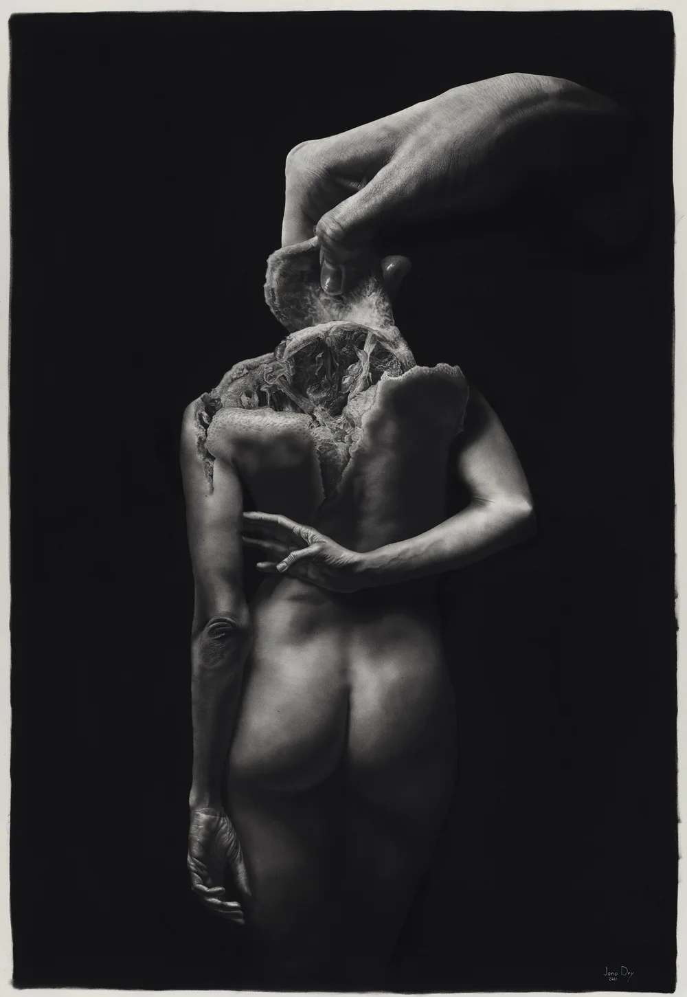
Jono Dry creates pencil and graphite drawings at large scale, and with incredible realism; Yet the subjects are strangely warped and merged with other objects.
His works were in my mind as I was thinking about how to blend my self-portrait with the trees in the background. My face becoming the rocks of a small islet that the trees are growing from and through.
I can only hope to gain this level of technical skill, though this level of realism is not of interest to me personally.
In the particular work, above, I like that I can see a particular narrative or message. The body arranged from consumption, their identity removed (in that they are missing a face/head).

On Surrealism
Following conversations with my tutor, I’ve returned to this post to expand upon Surrealism.
It is interesting how my vocabulary has changed through this course. When I first noted Jono Dry as an influence I didn’t really have the word Surrealism in my tool set. Yet, in retrospect, how I’ve articulated how his art draws me in is speaking of the surrealist aspects of his work. I’m drawn to the unexpected, dream-like or hallucinatory associations.
I like the absurd and irrational connections that evokes stories, myths, and dream time imagery. Beyond this assignment, I can see these influences throughout the work I’ve done as I’ve pursued art prior to this course.
Some of my best ideas arise when I’m at the edge of consciousness. Whether because I’m waking, and can hold onto the images that arose while I slept, or as I’m drifting off to sleep and can rest in that halfway point between wakefulness and dream. This feels akin to the aims of the Surrealists and channeling the unconscious2.
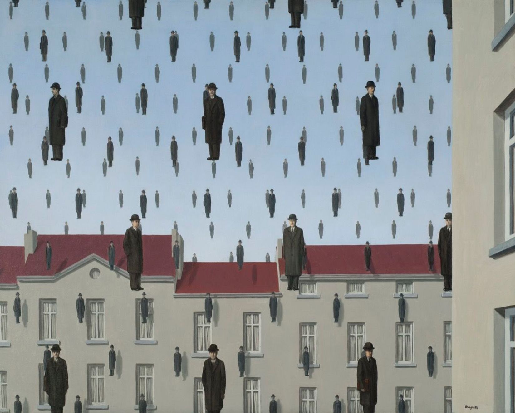
In terms of artists, René Magritte has been an artist that has been in the back of my mind since high school. Perhaps via mass media, or perhaps from high school art history courses, the works The Listening Room(1952) and Son of Man(1964) have bounced around imagination.

Is it odd how much I avoid Dali and Max Ernst in my work? They seem like the go-to when Surrealism is spoken of. How do I describe this? Their imagery feels too slippery for me. I struggle to find purchase in their works. They don’t resonate with me.
Perhaps it is the balance between the surreal and real that I seek. As I look at the imagery I’ve referenced here, I can see narrative or focused elements of absurdity. There are places for me to squarely put my feet, metaphorically. If I look at Ernst I oftentimes don’t even know what I’m looking at, while Dali’s work is frenetic to me. Restless and disquieting.

And yet. How much of the mass media I’ve consumed can lend its own influences to Ernst or Dali? Or my own art, where human and animal aspects blend together, or faces become trees? I look at The Eye of Silence (1943) and I can see how other artists I follow have been influenced.
Florian Meisenberg
The artist, Florian Meisenberg, used a computer controlled process to draw the intricate figure in the center. That intersection between the analog (The artist directly working on the canvas) and the digital is quite interesting. This gave me the idea of drawing upon my old computer code to represent my career and profession.
Ben Woolfitt
Visiting the Ben Woolfitt exhibit at the AGO made me think of metal foil as a material. I immediately shied away as my first impression it might be difficult for me to avoid over-using it, or otherwise compromising the rest of the piece with a material that is so very attention-grabbing.
This is what brought me the idea of using imitation gold foil, very sparingly, but with the long-term view that the gold will tarnish.
John Virtue
I also took into consideration the research exercise on John Virtue, wherein the artist talks about collecting images and bringing them together. I don’t have to draw only what I see, but I can construct and compose. I don’t have to imitate the real unless that brings me closer to the intent of my work.
Process


Following the addition of the code, I started having serious reservations about adding any of the other media. Additionally, I became worried about the sheer amount of complex forms and a lack of ‘rest’ space in the image. I decided to erase all hints of the clouds at this point.

Here is where I stopped. This is the same image at the top of the post. I tried examining if I could lift the code without seriously damaging the underyling paper, but the answer is: No, I don’t think so.
Its a real pity, because my method of constructing the code allowed me to look at it before it was affixed (code pages are glued to a tracing paper backing, and that backing is attached to the drawing paper). I had even sat back and was concerned that this might have been the outcome.
I’m disappointed here, but in some respects very happy with what I’ve done:
- Drawing from imagination. The work in this unit built up to allow me to create the various subjects in this. I think the trees on the right are well connected to the pastel drawings I did early in the unit.
- The central tree stems pretty clearly from the ink drawing of project 3.1
- There might be better ways of doing it, but resisting my natural inclination to just fill space has produced a reasonably effective sense of perspective.
Post Assignment Follow up
In the post-assignment conversation with my tutor, they suggested some corrections to the line work and rendering of the right hand set of trees. I’ve captured my process and reflections in another post, but have replicated those contents below
A key focus of the discussion was around considering the focal area of the drawing. Where do I want the viewer to spend their time and attention? What parts of the drawing serve to frame that focal area, or otherwise move the viewer back to the area of interest.
Part of this discussion was on my use of detail, and where i should be spending my own time as an Artist in the creation of that detail. Detail draws the eye, so if there is a background element that is of low importance, I should consider not giving it the same attention as I do a more important component of the composition.
Specifically, the trees on the right are rendered with a similar detail as the island/face. I should consider how to push these trees back, much like I did the background trees on the left.
That said the reason why the right hand trees are so detailed is that they were a drawn from specific studies I was doing during my September vacation. I think I ended up trying to recreate those studies too specifically rather than consider them in context of the entire image.

Revisiting the Trees
I was looking at other artists in my social media feeds, and coincidentally Ian McQue was posting tree studies. I like how he rendered a mix of detail and contrast. Perhaps I could take some influence from this, but I’d have to make sure I didn’t make the drawing this crisp. Otherwise, I’d just be replicating what I already have in terms of detail.
I have a good feel for how I want to edit the drawing, now, and will get to that over the Christmas break. This in contrast to Assignment 2 which I still want to go back to, but don’t have a good grasp of how to adjust.
There were a couple points I wanted to adjust with the trees in question:
- The use of line was too sharp, drawing the eye too much.
- The complexity of the contrast was too high, again pulling the cluster of trees into the foreground.
- A couple of the trees have unnatural bends, and if I can adjust that I should.
The first step was taking my putty eraser to the area and picking up as much of the graphite as I could. I found the paper had been pretty abused, in this area, and so I had to be careful as I used the eraser and as I reapply marks.
A few things I wanted to preserve:
- The sense of forest was important. I wanted it to feel like there was depth there, rather than a couple trees just sticking up on a rock.
- I wanted to maintain an echo of the rocks and water plants, to keep balance with the left side.
With the excess graphite removed, I went back through with a 6b graphite block. Using the block prevented me from getting to stiff with precise lines. the soft graphite could then be pushed around well with a blending stomp.
I didn’t blend all the graphite, as I wanted to give an impression of the tree needles via the graphite sticking to the tooth of the paper.

I’m not sure how successful this change is. It feels like I need to add contrast back in on the extreme right. That said, those trees feel much further back now without sacrificing the shape of the trees.
I like how I was able to show the tree trunks via the blending stomp, rather than line, and it feels much more like there is depth there.
Mark Making


Throughout my feedback sessions, my tutor has made specific comments regarding my use of line. In each case, my tutor was drawing my attention to particularly freeform marks.
I’ve displayed specific sections that my tutor identified, to the left.
As I look at these, I see forms that I was trying to suggest without having a specific outline to follow. I was trying to create volume within a form, but without a concrete seam or physical structure to follow.
In assignment 3, I was thinking about bark and its random squiggly nature. I didn’t want to render every edge as that would serve only to flatten the trunk and become too busy. I wanted volume, and I think I achieved that in a fairly convincing way.
In assignment 2, I’d chosen to use a white gel pen to create the light relections. But those reflections are fuzzy, and indistinct. The medium I chose didn’t really smudge or blend, so I had to try a different method. Here, I found hatching and squiggles to be fairly effective. I’d argue these are some of my favourite parts of that work.
1 No. 518: Hugo McCloud, Ulysses Jenkins (2021) At: https://manpodcast.com/portfolio/no-518-hugo-mccloud-ulysses-jenkins/ (Accessed 07/11/2021).
2 Surrealism – Art That Captures The Imagination (s.d.) At: https://theartling.com/en/artzine/what-is-surrealism/ (Accessed 18/05/2022).