I had held off reflecting on the feedback from my second assignment. Partly, because I didn’t know how, and partly because I was caught up in vacation planning. My intent was to have completed this reflection upon my return to civilization from camping, but my attention got pulled into the Unit 3 work.
So, here, I return to reflection. As a reminder, here is the piece in question.
This session with my tutor was fascinating, and I kept running into a gap in my vocabulary. Its in the areas that I don’t understand, or don’t have the words, that I find myself growing the most.
I will admit, here, that I still struggle with this vocabulary and way of thinking. I may not be able to express myself well here.
We talked about what Art is. Where in the making does the Art occur?
As I submitted I had considered the roll of paper, and the drawings upon it, the art in question. I had filmed it, as I did, as I wanted to convey in some sense my inspiration of walking in front of my living room mantle. Not that I had articulated that well in my post on the assignment.
Perhaps it is that the rolled piece of paper is only a component of the Art, and the other component (and maybe the more important?) is the video of the unrolling.
Thinking about the technicals a little.
- I rely very heavily on outline. This has the result of flattening objects, despite what I might do with highlights and shadow. I can see where this comes from — where I studied comic book drawing for a bit. I recently attended a Picasso exhibit, and it was interesting to see him applying heavy prussian blue outlines in some paintings. But even there, I think, the purpose or intent may be exactly that flattening? Those paintings were clearly leading towards cubism, even if not yet there.
- When I didn’t, and instead just let a brush define the form of the lamps, the result was extremely effective.
- How might I consider doing the same with the red oil lamps? for the clear oil lamps, I could use a very pale alcohol marker that would tint the paper without creating outlines (I think?)
Revisiting the assignment.
My tutor and I discussed going back and revisiting parts of the assignment. I made a few technical errors that bother me, and I want to correct those. But, also, I’m stronger now from having created this work and going back will let me apply what I’ve learned uniformly.
In particular, consider how I’ve co-mingled flatness and volume, and choose how I want each time created. Should the glass items be rendered flat? Should they show volume? Is the space between items the right spacing? Are there ways of ‘encouraging’ or leading the unrolling of the paper via the distribution of the items on the mantle? Choose how I want to show the mantle itself. I noted, above, different ways of showing the glass objects. I also discussed, with my tutor, my dissatisfaction with how I had drawn the urns.
I have no yet done the above, though I have taken out and looked at the piece a number of times. This is very intimidating, and I let that intimidation get in the way of my timelines for Unit 3.
I fully intend to get this done, however.
Artist Reflections
My tutor suggested I look at a couple artists and discuss what I discover. I’m going to catch up the suggestions from unit 1 as well.
Caragh Thuring
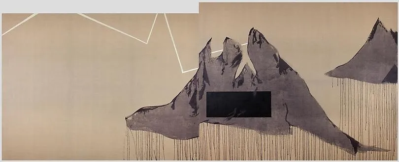
Caragh Thuring’s images are incredibly diverse. There are many, like the one I show here, that I just don’t have the visual language for. What am I seeing? Mountains? Or is it multiple cloaked figures surrounding something? Is that a lightning bolt?
In other works I see windows and buildings, or people and so forth. Perhaps I need to see these pieces in person — that certainly helped me grasp Andy Warhol.
Florian Meisenberg
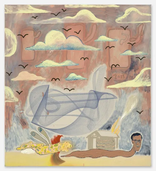
Very clearly, this artist’s work is filled with symbols. A slug person, flying creature and birds give me an impression of travel at different speeds. A house is on fire. There are clouds, and indecipherable background forms. And then a mathematically precise form in the center. What do these things mean together?
The name of the work gives me the idea of juxtaposition between the experience of human live, versus machine.
Cy Twombly
. Courtesy Christie's New York.")
I’ve never been a fan of Cy Twombly, but this image grabs me. I see violence. My brain’s need to see forms sees something monsterous here (the large red splot is a mouth, and the circles beneath are teeth). I see the streaks of bloody hands in the red-streaks in the bottom right. Disturbing. I’m unsure what this says about me, though I wonder if this is part of the intent.
Reading what the MoMA writes* about the work gives me no parallels to my own interpretation.
I think my general dislike of Cy Twombly’s work stems from a lack of understanding of how to look at it. My reactions tend to stem from representation (as you can likely surmise from my interpretation above), and when there is little to hold onto then my reactions trend towards neutral.
Julie Mehretu
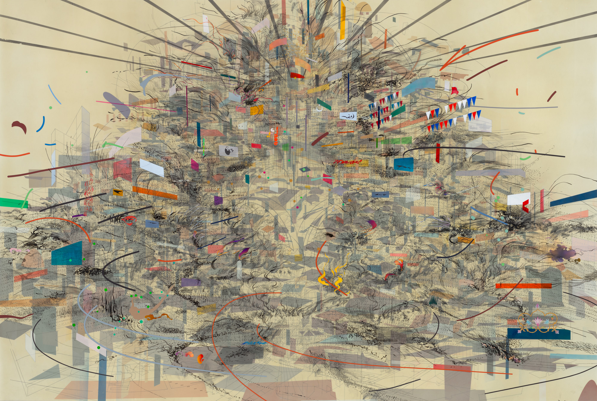
Although my tutor suggested this artist, I’d actually spent some time at the Art Gallery of Ontario, examining a few pieces by the artist. In the image I linked here, I see a massive futuristic cityscape. The arcs of planes, or other fast transport. Hanging laundry, and a thousand buildings. In the images at the AGO, I saw fences and brush and trees. I quite like the images, though i can’t look at them for long — they make me tired.
Paula Rego

I think, in many ways, I’ve fallen in love with Paula Rego’s work. Its dream (nightmare?) like. Stuffed dolls acting out some form of pantomime. The expressions, here, are of horror.
In general, I like how the artist plays with space. In many works, the characters have a sort of hierarchical sizing, instead of perspective-driving size. There is a mythical quality.
One area I struggle in my own work is the background. What do I do with it? How do I render it such that it doesn’t pull the eye away?
In this work, the artist has layered tones, avoided any representational marks. blocks of tone are all we have to describe the space and yet it is very effective.
Readings
My tutor linked me to an essay that might help me shed some light on my own struggles with not knowing. I’ve read it a couple times now, but I’m still working through what I’m taking from it.
A few immediate reactions.
- In the essay, an artist talks about “Silence and the quiet mind”. That is a very foreign concept for me. My mind is never quiet. Never silent. Even when I’m sleeping, it is going full steam and I often become aware of my thoughts while dreaming. This has been helpful — where I’ve worked through some particularly complicated programming problem while I’ve slept — but often makes me prone to rumination. It also makes me very distractable.
- It was interesting to me to see a discussion that spoke of Intuition as a bad thing. In my professional life, I am a software engineer (at least by training and preference). When I get the opportunity to write code, these days, it is entirely intuition driven. I just know how to get from A to B, without any formal consideration or design. It is a function of having done this for almost four decades, I suppose. This Intuition is very much part of why I’m good at what I do, and why my colleagues desire my involvement. It was interesting that in the Art world there was an aversion to this sort of work.
- Part of the essay dwells on how artists don’t know the outcome. That this process of making is a process of discovery. I can feel the edges of that, when I’m making, but I still feel like I’m in the “not knowing what I’m doing” rather than “not knowing what I’ll end up with” camp.
- Another part of the essay talked about the studio as a special hallowed place where artists can Do The Work. For me, the room I’ve dedicated as my ‘studio’ is where I do my making. But it isn’t at all where I do my thinking. In fact, if I try to do reflective work in that room, I inevitable choke and mentally block. Thinking, planning and designing happen elsewhere in the house — usually as I’m doing some other task.
- *Cy Twombly. Leda and the Swan. Rome 1962 | MoMA (s.d.) At: https://www.moma.org/collection/works/80083 (Accessed 07/11/2021).