Research: John Virtue and Deanna Petherbridge
John Virtue
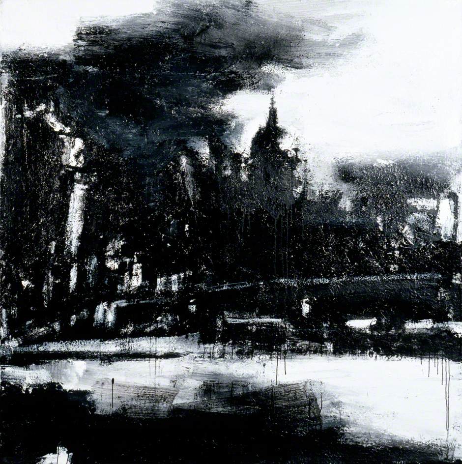
- The artist, I think, is painting the idea of London. While editing and moving the cityscape, without the traffic, and the people and the noise, the city becomes the concept of London rather than a depiction of place.
- Perspective is treated interestingly. The foreground in many of his paintings are abstracted sweeps, while the background is the skyline of the city. With the use of the black & white alone, that skyline becomes three dimensional.
- My immediate reaction to these paintings was a bit of fear, what is interesting. Certainly their scale is intimidating, but the stark monochrome gives it a nightmare sense to me. I like that, even though the subject matter isn’t quite my thing.
- John Virtue’s comments about the master paintings was intriguing. It seemed he was discussing composition, and finding foundational shapes — or is “movement” the right word here? That was interesting.
- His application of ink and titanium white paint reminded me of the painting work of Ben Woolfitt. The layering is interesting, and complex.
- In the blogpost, the author talks about ‘rigour’ and ‘promiscuity’ of process that John Virtue follows. The idea of using a single set of mediums (black, white) for decades is remarkable to me. I have great difficulty sticking to any one way of making, though I do seem to circle around graphite.
- Despite the lack of detail, it feels full of life. Though I am thinking of the Victorian coal smoke fogs.
- I know the artist uses only black ink, and white acrylic. But I see so much blue in the image linked.
Deanna Petherbridge

- I immediately draw a parallel between the two artists here. Deanna Petherbridge constructs a destroyed city in great detail. John Virtue deconstructs an intact city, leaving it rendered in phantom shapes.
- This work reminds me of MC Escher, and I find myself looking at it in the same ways. My eyes are finding the planes and lines, and navigating around the city forms, looking for surprises. I didn’t do this with the John Virtue paintings, which I took in in swaths.
- Many of the planes of perspective are tilted up, making it feel like the city is falling towards me.
- I feel the emptiness in this work. Its detail makes me want to find the people. the inhabitants. But they aren’t here — this city has been killed.
- The process of this piece is also very intimidating. I have trouble maintaining my focus, and this work is truly one that would require incredible focus.
- I’m reminded of Julie Mehretu here. And I can’t quite figure out why.
Similarities and Differences
- I’ve already noted the differences in rendering of detail, and intricacy of the perspective.
- Similarly, they leave people and cars, and other day-to-day objects out of their works. In both, it feels like the artists are rendering the presence of the cities in question rather than any particular scene. How does an artist depict an emotion or feeling, just in black, white and line
Other Thoughts
- I like the idea of the artists gathering ideas by making sketches of areas or reviewing photographs, and then bringing them together into new collections. Like mental collage. I have a number of small items I’ve picked up on walks. Feathers, dried leaves, stones, etc., and this feels very similar. Items or images to gather together and do something with later.
Exercise 9: Sketchbook of Townscapes
We’re well into a rainy autumn, which gave me some constraints in walking about and sketching. That said, there were a number of interesting architectural features which I took a minute or two to record. I’ve selected a few such, here.


