This post is unfinished. As I progress through, I’ll collect my process and thoughts here.
Exercise 5: Fore, Middle, and Background
I was recently in my hometown, visiting my parents — first time since the pandemic. My partner and I were staying at a hotel, which provided some less than inspiring views over the city. However, they did provide material to thumbnail some ideas for foreground/middleground/background.
Similarly, my parent’s dining room has an interesting layout where pushing the perspective lets me construct the layers of the image to create that foreground/etc. As was I thumbnailing, here, I was thinking about Bonnard’s After the Shower, and how the perspective constructed the space.
I took a photo of my parent’s dining room to take back with me, when we left, and will use this as my subject matter for Exercise 5.


Reflecting on this drawing, there are definitely pieces I like and parts I could do better.
- I feel like this would be better if I had used line exclusively, or had eliminated most of the use of line in the background. When i was putting the window together I intentionally broke the lines up, and I liked that effect. This was dampened by adding the tone to the frame.
- I like the treatment outside the window, where line is sparse and no rendering is done. Here, i was thinking of how I did my ink drawing in Project 1.
- My perspective needs better attention. Either I should intend for walls to curve, or they should not curve — the paintings on the right need to be corrected. Its interesting how I don’t see these issues until I am looking at them here on screen, as I’m writing. I should spend more time away from my drawings before I decide they are completed. I’m reminded of my first assignment, where I put it away for a day and came back and was able to make it stronger.
- I could have removed more detail from the bowls/plates on the cupboard, but I’m fairly happy with how I limited my drawing of them.
Exercise 6: Parallel Perspective

In my thumbnailing, above, I was also experimenting with some graphite blocks that I had picked up. three of them were faintly coloured, water-activated graphite, and I wanted to get a feel for how they worked.
I made use of the ‘blue’ graphite, in the final drawing for parallel perspective. Using a razor blade, I scraped shavings of the graphite onto the finished ink drawing, and then misted water down onto the surface.
It created an interesting speckled appearance, which I think modified with sponges to lift up areas where the colour was too intense. I was attempting to leverage this colour for atmospheric perspective, alongside the reduction in detail in the distance.
The result isn’t quite what I was aiming for — I wanted a smoother tone — but the speckles do give me a sense of shadows amongst the leaves of my street. I rather like this drawing.


Exercise 7: Angular Perspective
I feel like I have been unable to disentangle all my exercises, this unit, with perspective. I find it difficult to draw the world, without addressing some level of perspective in the work.
Looking back at Exercise 5 (above) I’ve very clearly spent more time on the angular perspective than I have on constructing the fore, middle and background. Something for me to think about.
As I was spending time looking at what I had drawn, earlier, I proceeded to sketch in a house across the street from my own. I look at it from my second floor window, where my workspace is.

Exercise 8: Atmospheric Perspective
I understand atmospheric perspective more from the direction of colour and painting than I do from drawing. But let me see if I can find a path here.
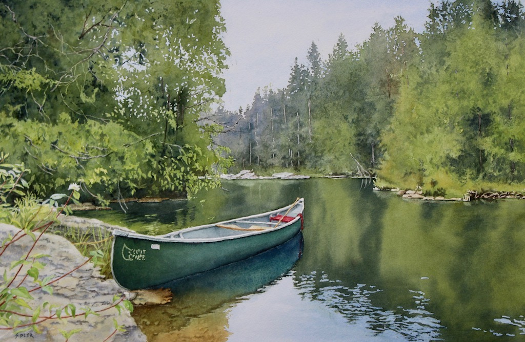
I’ve linked an image here, of a piece by a local artist that I purchased last year. Its of an area of where my husband and I like to go camping, and depicts the wilderness that we enjoy so much.
If I understand correctly, atmospheric perspective creates space by reducing the detail, contrast and saturation of those items in the far distance. From a physics perspective, the cause is light scattering off of water vapour in the air, which introduces a faint blue haze that obscures objects the further away they are. If you ever get the chance to see a video shot in UV light, this haze becomes incredibly oppressive and omnipresent due to water’s greater ability to scatter UV light.
I can’t remember the book I read it in (if it comes to me, I’ll link it here), but the author mentioned that “yellow is reduced as objects recede into the distance” and that has been hugely helpful for me to think about the effect. If I keep in mind that, and that saturation drops with distance, then reds become brown, and greens become blue, and I have a helpful framwork to work within.
Below, there are a number of techniques that I see the artist using in order to generate this atmospheric depth:
- Sharp, bright colour is used only in the foreground. In the mid distance we can see bright colour but the forms are suggested rather than sharp edged.
- In the background, the far trees are rendered in a blue grey.
- In the foreground, tree trunks are black, and in deep shade. the background, those few we can see are merely grey-white flashes in the background, with very little detail.
- Strong contrasts are kept to the foreground and middle ground. The background has a strong sense of tonal uniformity, and the trees even begin to approach the value of the sky.


We’re very distinctly into the “rainy season” of southern Canada’s Autumn, so I have little opportunity to spend time outside and drawing.
As such, I’ve pulled some photos from prior trips I’ve made, that gave me what I think I needed in terms of reference.
Am I being too literal with these?
I am trying to work quickly, and not get caught up in details and line, as the brief requests that we work in tone. I focused on using large graphite blocks, and water soluble graphite. In particular a couple blocks that are coloured. I quite like the blue toned blocks as they remind me of cyanotype — which is a colour I quite like.
I enjoyed doing these, though I’m not sure if I’m getting what I should from these. I keep wanting to pull out my watercolours and do a painting instead.
Research Task: Revisiting my mind map
My padlet doesn’t always render, so here is the direct link: https://oca.padlet.org/martin527275/lvuevbg66gy0xh0f
In general, I have a real rough time with this. I can see some obvious linkages in colour or subject matter, but I really feel like I lack vocabulary here.
I can see some connections, though these are connections I already. Picasso, and Braque and Jean Gris were all contemporaries and created work in the cubist style. Van Gogh, Monet, Turner and Seurat, etc.
Following the guidance in the course materials:
- Artist’s styles definitely change through their careers. I had noted this specifically in my exhibit notes for my recent visit to the AGO’s Pablo Picasso exhibit. Picasso perhaps represents an extreme of this, though Kandinsky’s evolution towards abstraction is incredibly extreme.
- I have trouble categorizing artists. In general. I seem to bucket people along a couple axis. My padlet is approximately organized according to the following.
- Colour versus monochrome
- Realism in rendering
- Landscape vs built environments
- Time period
- The various artists have some dramatically varied approaches.
- The Russian artists Brodsky and Shishkin have some incredibly realistic paintings, despite their impressionistic approaches. They feel very alive and real.
- In Tom Thomson I can see Van Gogh’s brushwork echoed. Perhaps I’m biased, here, as Canadian art history education is inundated with the Group of 7, and their impressionist connections.
- Stevnn Hall and Bethany Fields create the appealing skyscapes.
- Tian Haisu uses an ink pot attached to rollerblades to make her marks on paper.
- I created the padlet by selecting works for each artist either by selecting an appealing image from a google search, or by specifically searching that artist for landscape images. This has created a predominate tilt towards landscape images, though there are few others.
- I found creating specific links between the cards to be a frustrating exercise, mostly due to the tools involved. I want to create a wide variety of linkages, but the system didn’t provide enough flexibility. I sense that using physical index cards would be a much more fruitful process here, though I think my partner might think I was chasing a conspiracy theory given the number of pins and connecting thread I’d end up with.